When
taking photographs it is important to distinguish between colours
- in colour pigment printing and colour management etc. in photoshop
it is crucial.
A
colour can be defined in terms of:
HUE
SATURATION
BRILLINACE |
|
Hue is very much the prime quality of a colour - it
is the prime or what I call the HUEge reference
point for a colour.
The colours arranged around the colour circle are all different
hue, and all though they might be close to their adjacent
colours - they are distinct. In taking photographs, the
two ways that we can influence a hue are:
Using a different light source - like shooting at sunset
when the colours are warm in stead of mid day, or under
mercury vapour lamps where the colour is blue.
Using a coloured filter over the lens.
In either case its is only possible to alter the overall
hue not that of individual objects. |
|
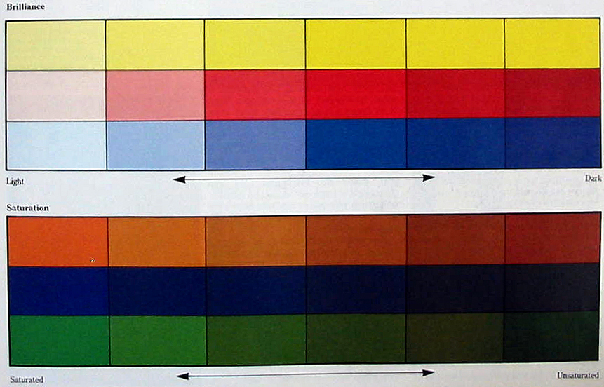
Saturation
This
is a variation in the purity of a colour - at one end of
the scale are pure vibrant - saturated colours - while at the other grey or dirty colours. So as hues have
more grey added, they become less saturated. This also happens
when black, grey white or opposite colours are mixed together.
As most colours in nature are unsaturated, this has a direct
relationship with taking photographs. In nature greys, browns
and dull greens predominate, and it is for this reason the
occurrence of pure colour is often sought after. Rich colours
are often seen as more desirable than subtle pastel shades. While we can intensify the saturation in photoshop with remarkable results, we need to understand how exposure effects satuartion. |
|
| |
|
Brilliance
Both brilliance and saturation are degrees of HUE not colours in themselves.
Brilliance is the lightness or darkness of a colour - white and black
are the extremes. It can be very difficult to distinguish
between brilliance and saturation, but it may help to remember
that in a range of brilliance, the colour
remains pure and unadulterated - and as I call it brilliant.
The actual range of lightness and darkness differs between
hues, which can cause difficulties in matching the brilliance.
Yellow for example can only vary from a medium tone to and
very light. Red becomes pink when very light - Blue covers
a full range. Because of its closeness to yellow, orange
does not have pure versions. The range of greens is affected
more by the blue component than the yellow and can be very
light or quite dark. Violet changes its character at either
end of the scale, becoming lavender when light, but hard
to distinguish from deep blue when dark. Brilliance depends
very much upon the light level - and in taking photographs,
a quality that can be altered through exposure. |
|
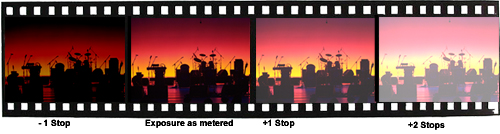
Under and over exposing a roll of 35mm slide film or shooting
a series of images with a digital camera of the same subject can
give a good understand of how brilliance works.
When the material is underexposed, the colours can intensity or
become slightly darker - when the film is over exposed it becomes
lighter.
 |