Sequence viewing > Aesthetics Index - Resource - ©
Lloyd Godman
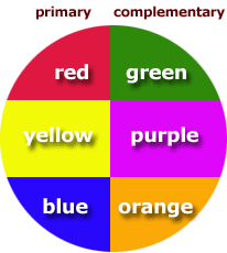
Working with Contrasting colours
Contrasting schemes
use shades from opposite segments on the color wheel. Contrasting bold
primary and secondary colors - red and green, yellow and violet, or blue
and orange - will create a very dramatic look. Contrasting colors can
also be created using pastel shades, also found as opposites on the color
wheel.
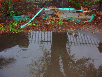
warm and cool colours – Find a subject with a contrast of cool and
warm colours
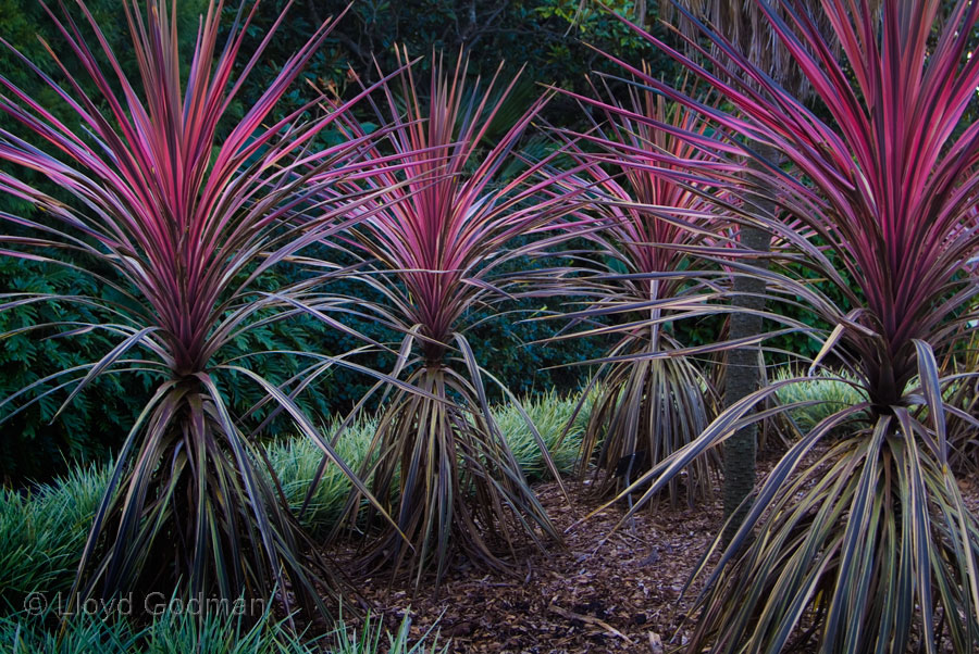

accent colours – A single accent colour can have huge impact in
an image particularly when the remain area of the image is desaturated
 . .
single colours – locate a subject with a subtle range of within
a single colour hue
Want to learn more? - do a workshop or one on one with Lloyd Godman
Comment on this resource
|