Sequence viewing > Aesthetics Index - Resource - ©
Lloyd Godman
Colour
Harmony
| While
certain colours relate to each other on the wheel, and we can set
up theoretical combinations, it is not enough to say they are harmonious. |
|
|
| Each
colour has an intrinsic brightness, so complete balance requires
that the combinations are seen in certain proportions. In photography
this is complicated by the nature of a given subject with details
of texture, shape etc. |
|
Mouse
over |
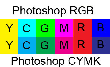
The
colour in a photograph is is enmeshed as part of the structure
of the subject. We can however look at the basic theoretical combinations
of primary and secondary colours. The complementary for each primary
colour is a secondary Red/green - orange blue - yellow/ violet,
|
|
|
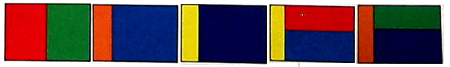
However
we have already seen something of the difference in brightness among
these six colours, and the strength of each in combination follows this.
In descending order the generally accepted light values ( Determined
by J.W. von Gothe, the German Poet and playwright, are:
yellow 9 - orange
8 - red
and green 6 - blue
4 - and
violet 3.
When
they are combined the relative values must be reversed - so that violet
occupies a larger area to compensate for it lack of strength. The areas
need for each of these colours are therefore-
Violet
9 - blue
8 - red
and green 6- orange
4 - yellow
3
mouse over for
grey scale
Want to learn more? - do a workshop or one on one with Lloyd Godman
Comment on this resource
|