
|
We have great and dramatic contrast in this example of black and white. While this might be inherent in the tone of the subject, it can also relate to the difference in light falling on a subject as light and shadow - |
|
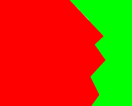
Contrast in colour can also work in the same way - the greater the contrast the more the zig-zag line between the two is defined. |
|
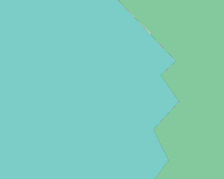
When the contrast is more subtle the effect is not as graphic and the line between the two less defined. |
|
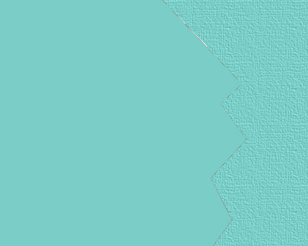
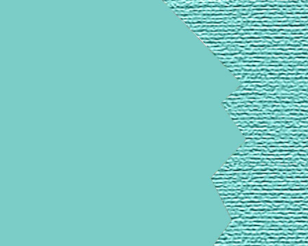
Contrast in texture can also act as a means of defining one element from another |
|
The greater the contrast in texture, the more graphically the two are defined. |

|
Contrast in shape also acts as a means of emphasizing an element within a picture - Here our attention is continually brought back to the square. |

|
A contrast in direction also gains our attention in an image. |
 |
Contrast in sharpness also acts to draw our attention to elements in an image - |
 |
|

|
|
|
Here are some examples.
An
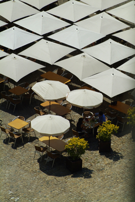
approach might be to play with groupings of many and few- we see the difference in shape acting to draw our attention |

|
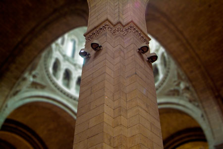
Straight
/ angular
This draw our attention to the steps - |
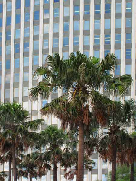 |
Nature - culture - the irregularity of the tree shapes to the vertical horizontal structure of the building |