Sequence viewing > Aesthetics Index - Resource - © Lloyd Godman

Colour and the visual conversation

Similar colour is often used to integrate visual elements of an image. We see it used effectively in magazine page layout where the colour of area of text are often similar to visual elements within a photograph on the page.


When we have areas of a similar colour in an image there is a “visual conversation” where they talk to each other.


Here we see the two red umbrellas connecting with each other - there is a "Visual conversation"


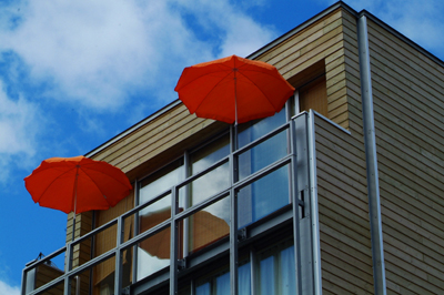
Once we are aware of this, we can use this visual strategy when we take photographs. We can look for elements of a subject that have similar strong colour that often contrasts with the surroundings and place then in the frame where they set up a strong “visual conversation”.


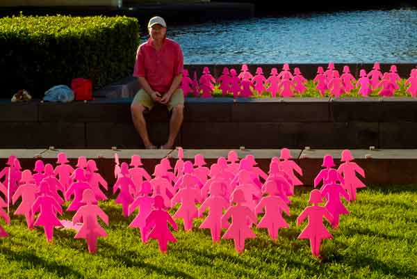
Here we see the two areas of pink relating to each other. However there are also other colour conversations -

the red of the shirt and the bag are "talking" to each other

the blue water and blue object by the red bag

the green grass in the foreground and the green of the bush on the top left.


Like wise once we are aware of how colours relate to each other we may also want to avoid some elements of a similar colour in the frame that conflict with the theme of the image. We do this by framing in a manner that eliminates them.


Want to learn more? - do a workshop or one on one with Lloyd Godman

Comment on this resource