Sequence viewing > Aesthetics Index - Resource - ©
Lloyd Godman
Colour theory in photography
When we study colour we need to define what system of color we are looking at -
Aesthetics and Design
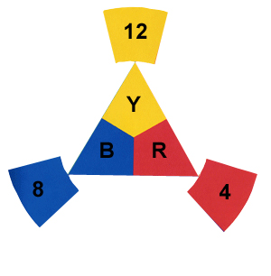
In design and aesthetics where we are looking at the relationships of colours within an image - a photograph, print, painting. We have Red, Blue and yellow as the primary colours |

|
Photoshop
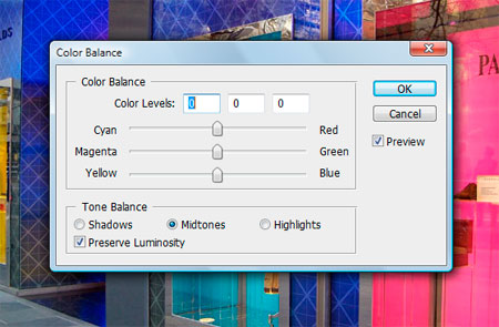
In photoshop we are concerned with the control of colour within the digital image - here the primary colours are
at the opposite end of the slider control are the secondary colours, Cyan, Yellow, Magenta.
- Cyan is opposite red because there is no red in cyan
- Magenta is opposite green because there is no green in magenta
- Yellow is opposite blue because there is no blue in yellow
it is easy to confuse this system of controlling colour with the system above for designing and critiquing colour within an image. |

|
Colour enlarging - mixing light
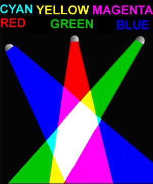
In analogue colour enlarging of a photograph we are looking at mixing light and we use the secondary colours of:
- Cyan ( which is a combination of green blue light - we see this in the illustration where the two colour cross over)
- Yellow ( which is a combination of green red light - we see this in the illustration where the two colour cross over)
- Magenta( which is a combination of red blue light -we see this in the illustration where the two colour cross over)
so each of these secondary colours is a combination of two primary colours
a combination of there primary of secondary colours produces white |
 |
Painting
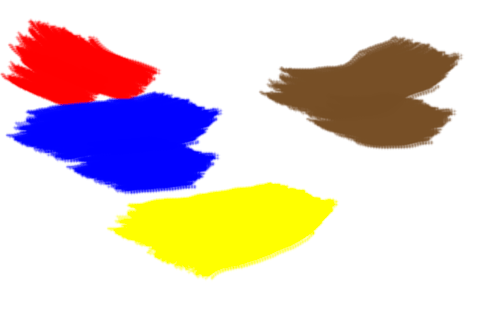
However,unlike mixing light as in photoshop or in enlarging, with graphic arts like painting when we mix the three primary colours red - blue - yellow we have a dark brown |
 |
Want to learn more? - do a workshop or one on one with Lloyd Godman
Visual
balance and weight
|
|